Project Type

Individual Interaction Design Project

Role

UX Researcher and Designer

Duration

September to December 2018

Skills

User Interviews, User testing, QOC analysis, Storyboarding, Wireframing, Digital Prototyping, Interface Design

Context - Indian Rural Population

Challenge

Build a community where people can share their problems anonymously and help others to overcome their barriers and succeed mentally and physically.

Why?

With the internet penetration being 460 million users per day in the rural areas and smartphone becoming cheaper and availability of health care professionals very low, people find it more and more challenging to discuss their problems especially women because of family rules and traditions.

Solution Overview

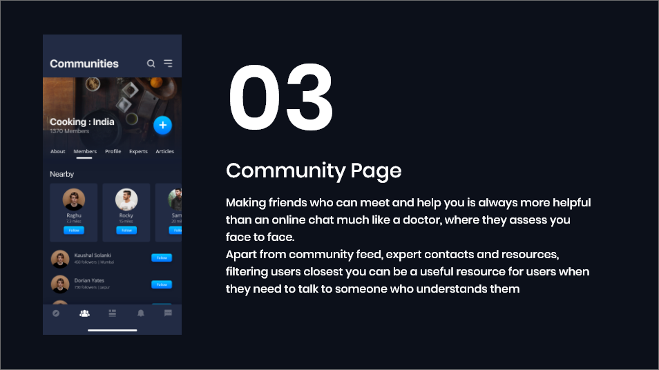
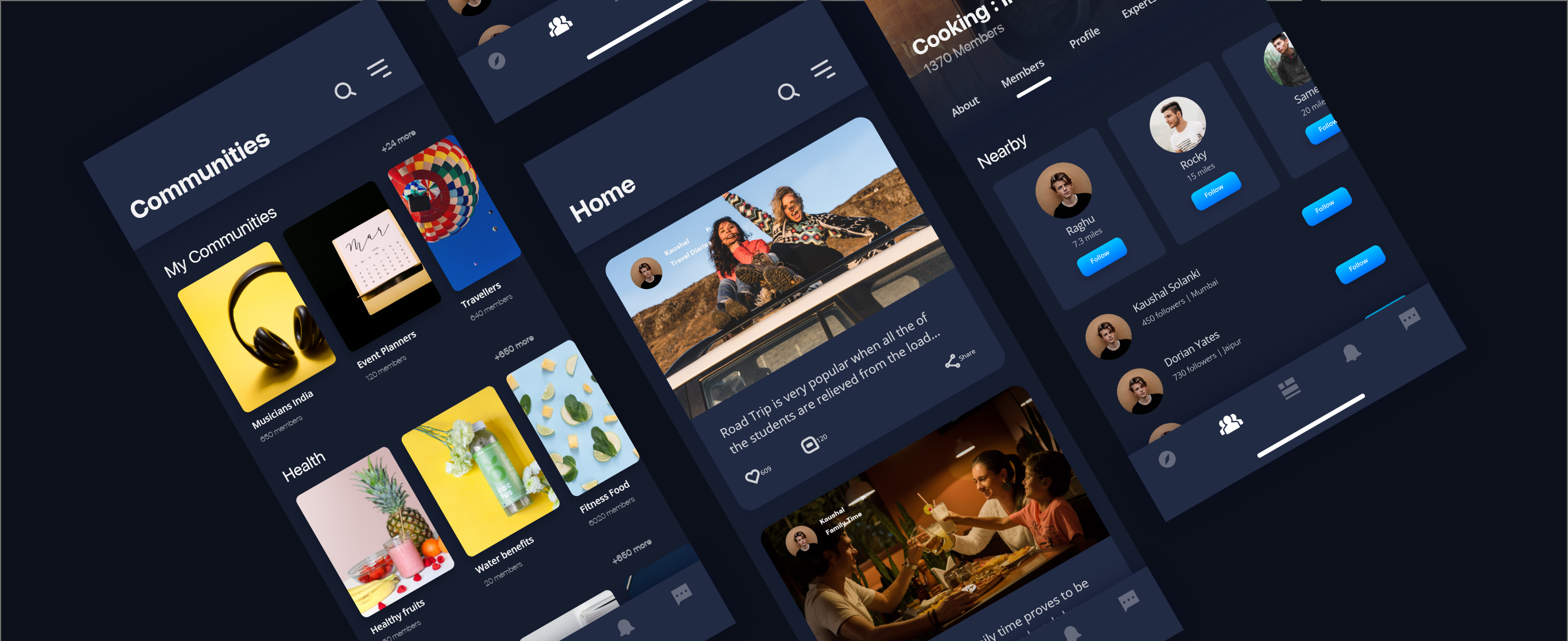
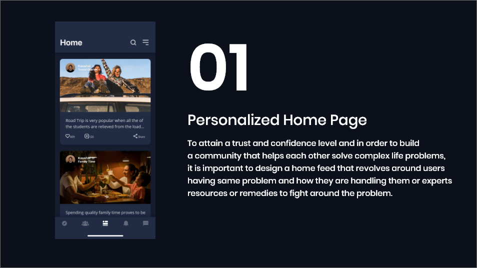
A mobile app concept that helps users communicate and explore information and other users in a non-overwhelming way hence allowing the users to find the best resources, experts, and friends that can help them overcome a challenge. Here are some of the critical features of the solution.

2 3 4

Methodology

5

Target Population

6

User Research

I reached out to several of my relatives who lived in our maternal house in a village to understand how they solve it if such a problem exists and do their friends talk to them if they had a similar problem. I interviewed 7 users - 4 through phone calls and 3 using Whatsapp call. The answers helped me design personas and existing preliminary alternatives. I used some of the existing alternatives as an inspiration for some of the design features

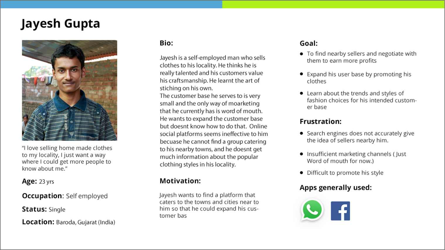
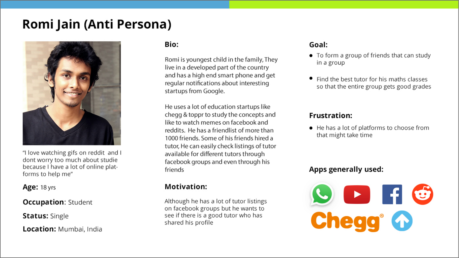
Persona

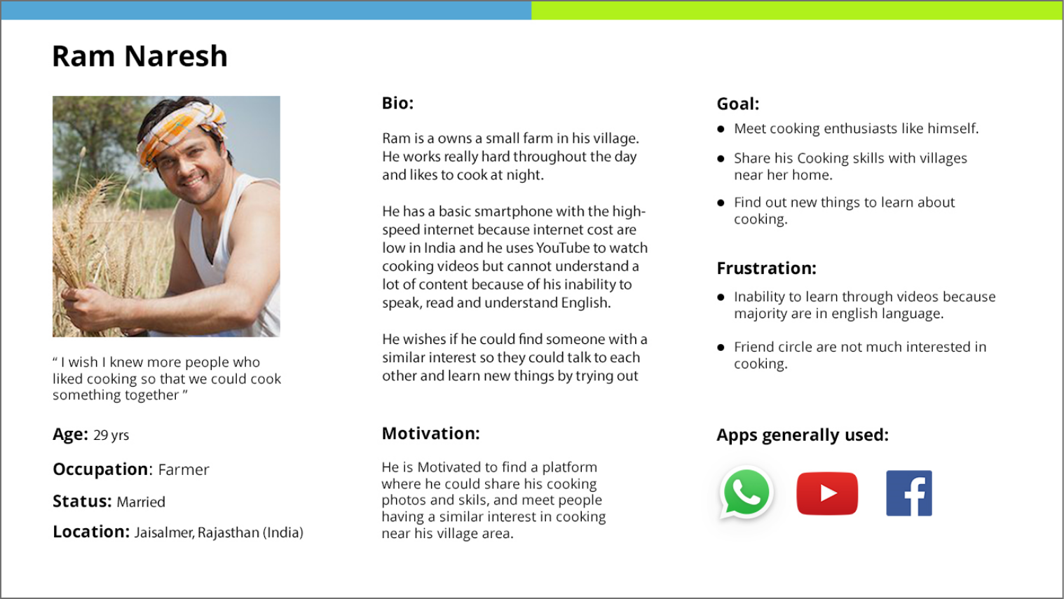
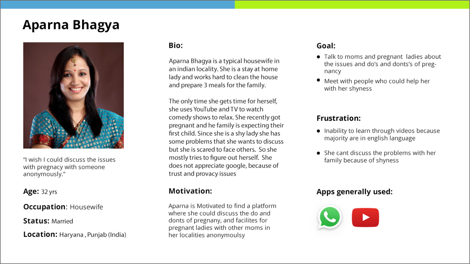
My goal was to come up with 3 primary personas and 1 anti persona. The primary personas helped in finding the user needs more efficiently, and the anti persona made sure that I was not going out of scope.

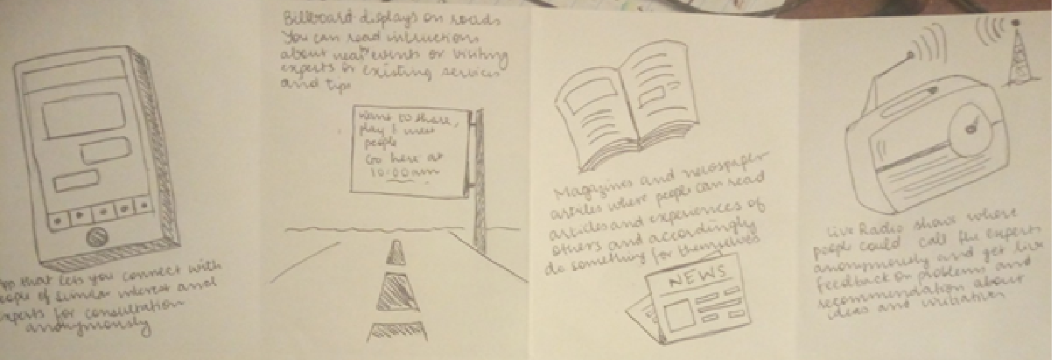
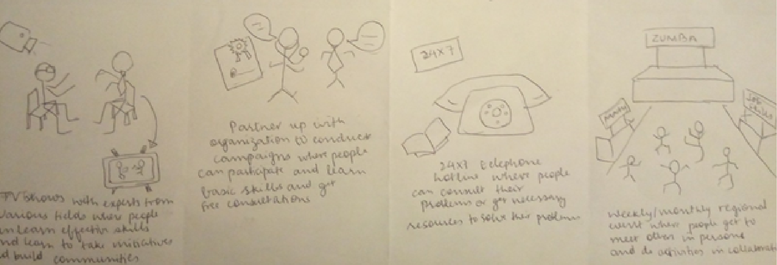
Sketching Alternatives

The main goal was to analyze the current solutions and ways through which people form communities, learn new things, and share problems. I used some non-tech solutions as an inspiration in my application.

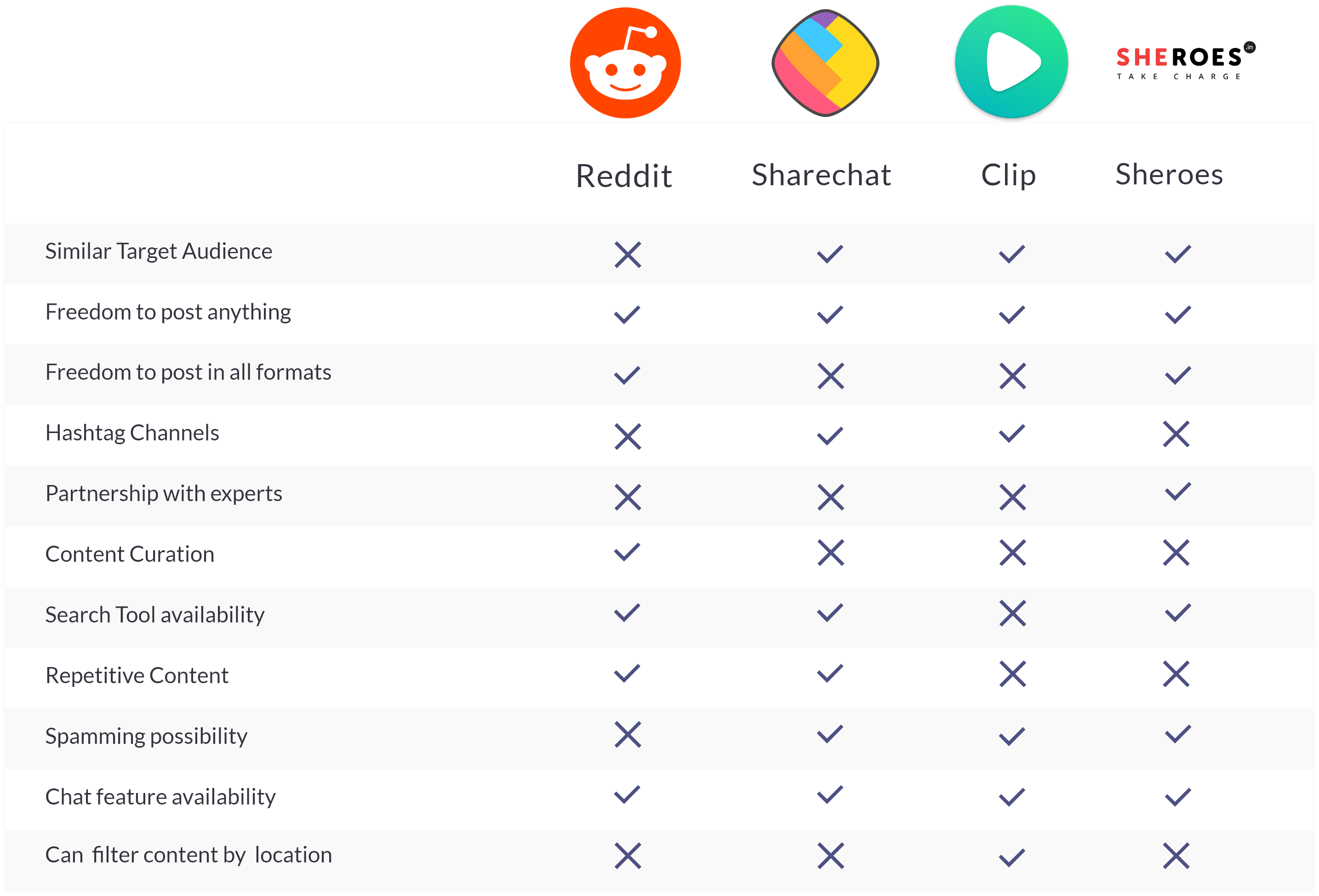
competitive Analysis

Flow Mapping

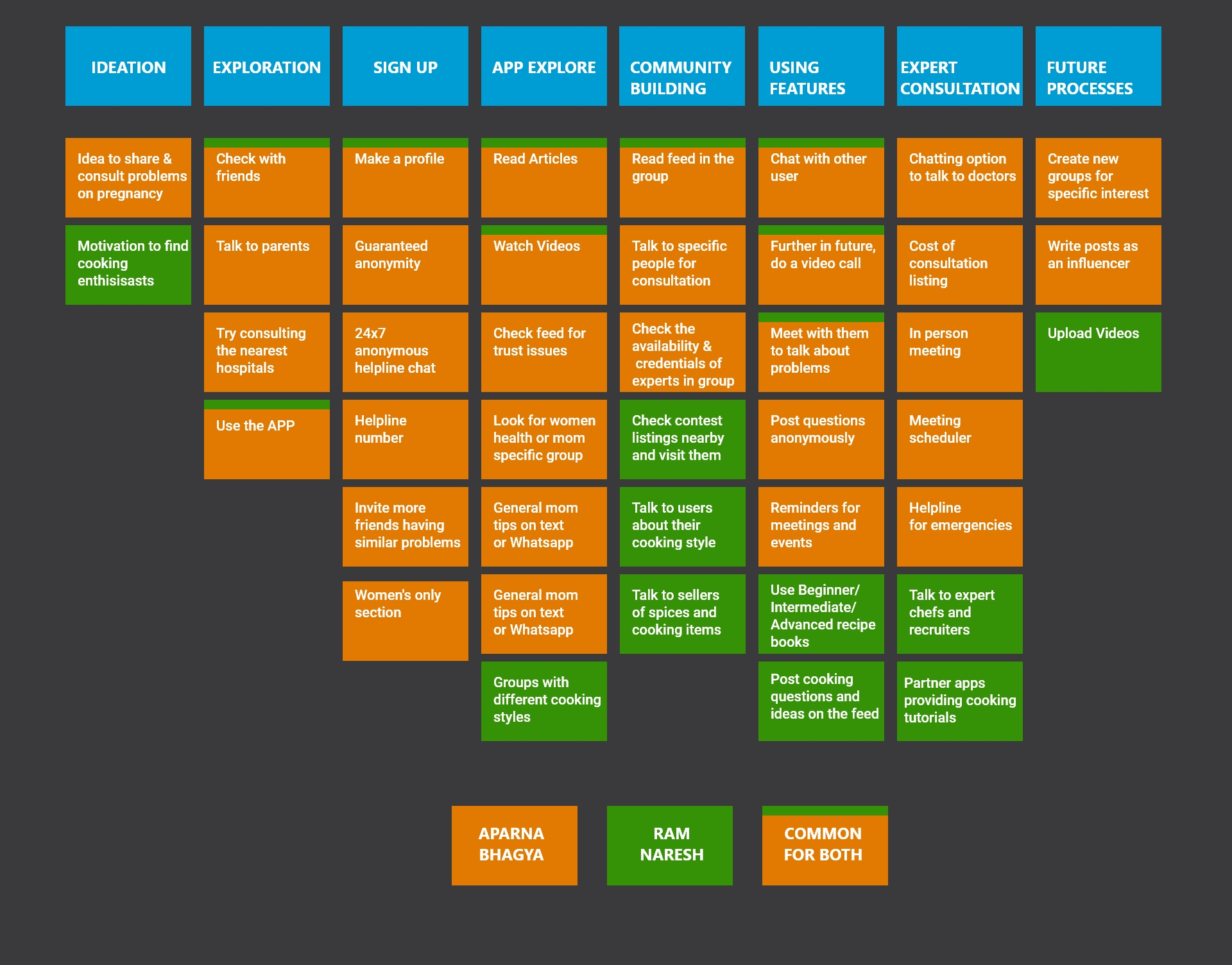
Flow mapping helped me in 2 ways. First, it makes it easier to paint a holistic picture of the Individual needs of personas at every stage of the product, and secondly, it helped me while doing the QOC analysis and wireframe design.

QOC Analysis

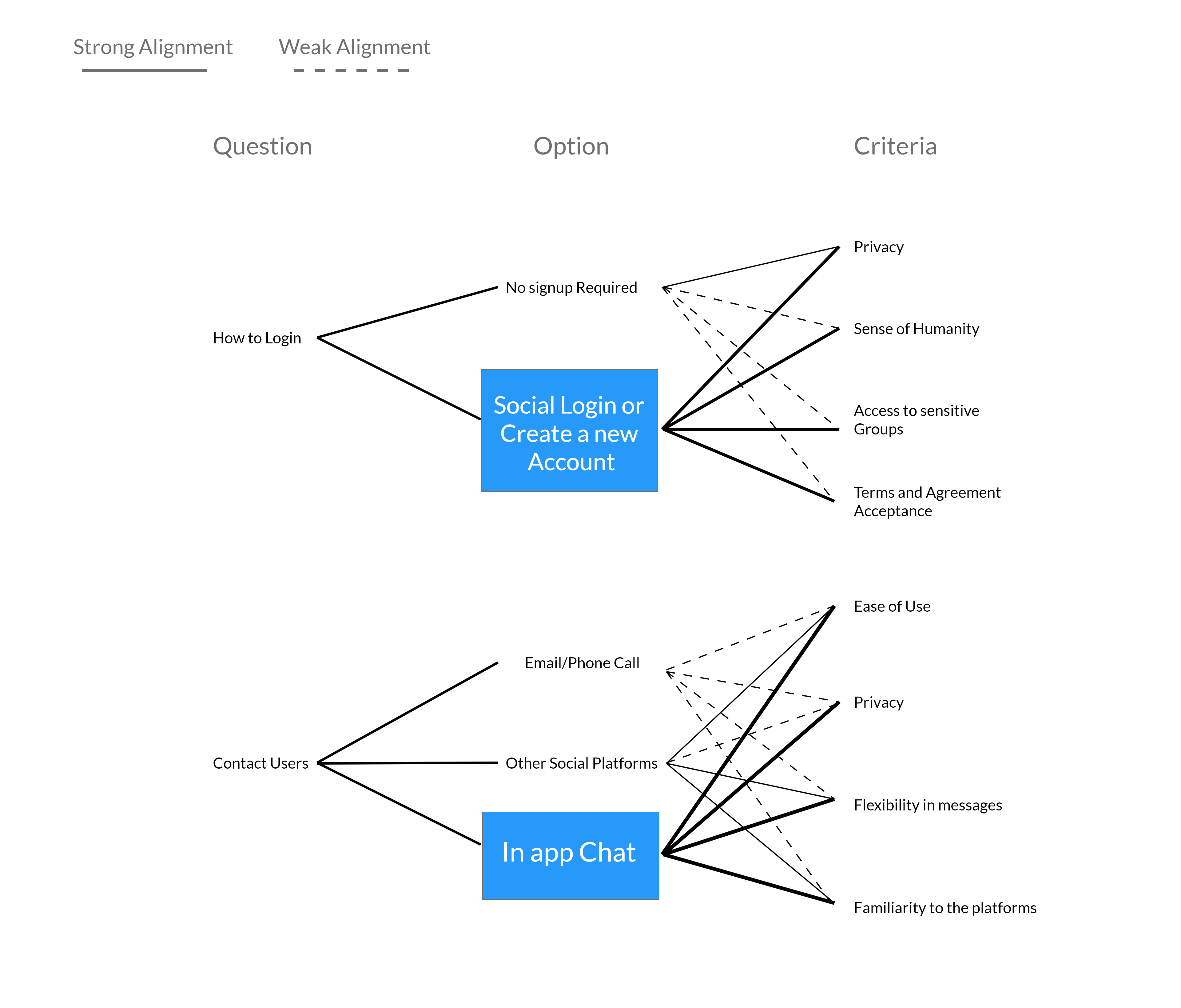
The process of Question, option, and criteria helped me analyze all the possible alternatives to a problem in UX and choose the best on the basis given criteria.

Wireframing

I first created prototypes on paper because of its ease and flexibility in creating and receiving feedback, after multiple iterations, I designed the final digital prototype on Adobe XD. What did I learn?

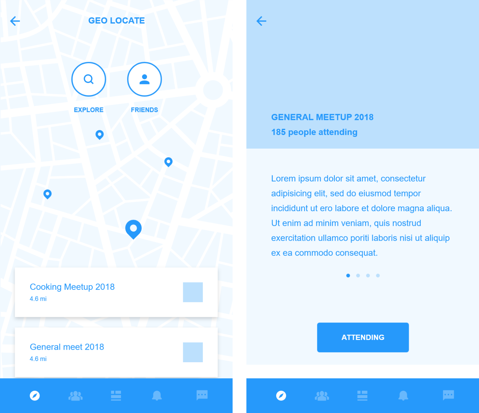
A key feature that I discovered was the need for events and their locations

Since people are encouraged to meet like minded people, it would be more beneficial if they all go to a common event like a Yoga Session or a talk from experts if they are happening nearby

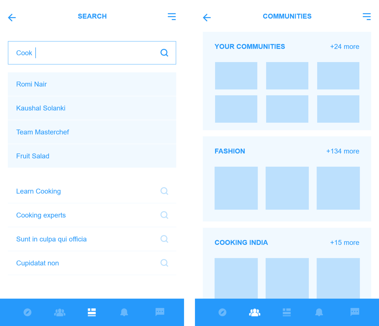
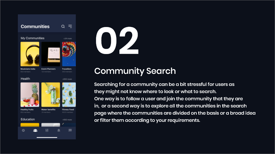
Adding Top users in the search results was liked by many

Adding the top users would be beneficial in two ways, first - Users can follow them or ask them for their help with more confindence since they are the "top users" and secondly, they might be a part of some other less know community which may be more aligned to the user's need which might not appear on top during the search results.

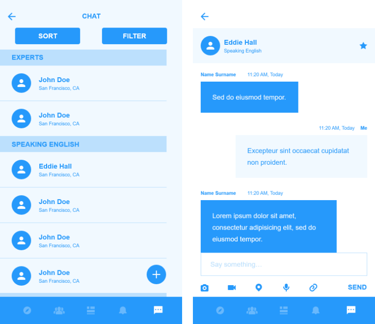
In-App chat feature is a necessity

Since the app focuses on maintaining anonymity, having an in-app chat feature aids the purpose. Some conversations are rather sensitive and requires a private chat, however asking for the other persons phone number or email defeats the main purpose. Therefore, an in-app chat feature is a must

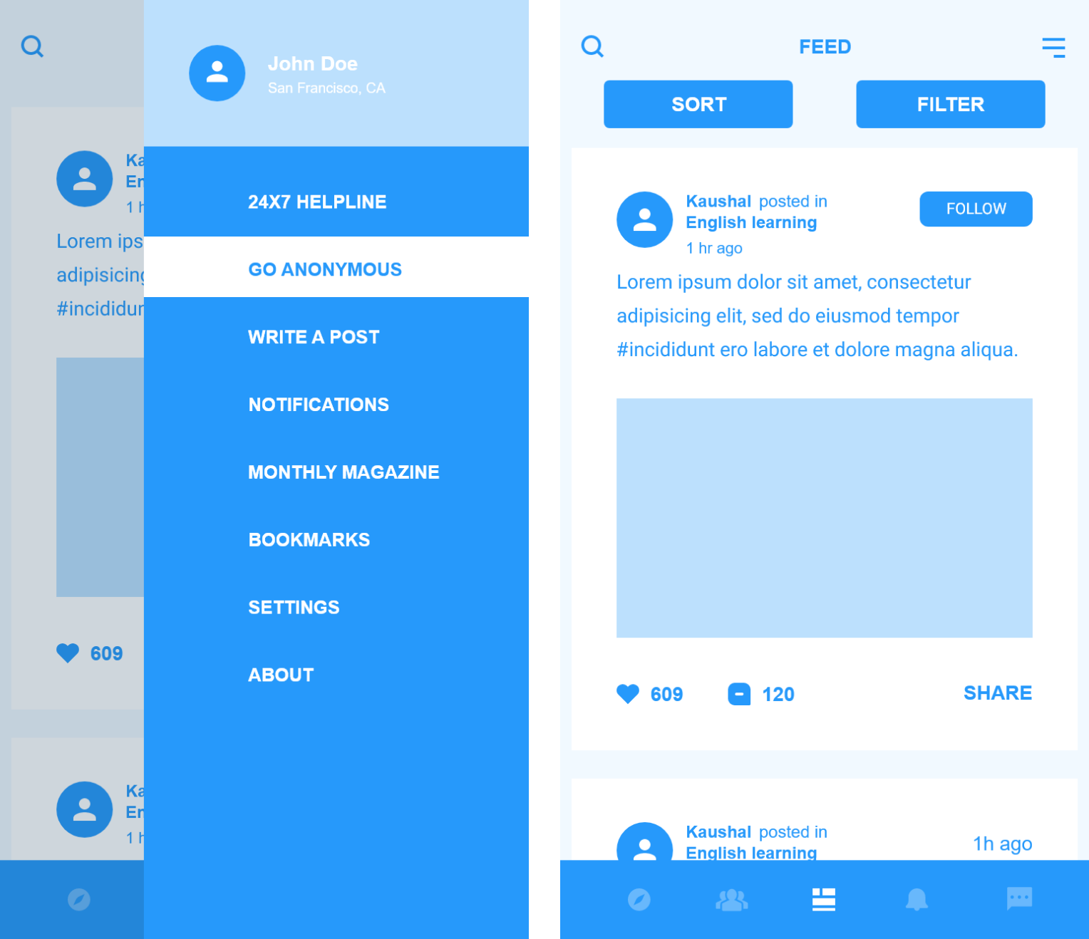
Adding a "Go anonymous" feature was the favourite

This feature when used, helps the user to browse all the communities and ask any question without the danger of them being recognized. However, a particular session lasts for a day therefore any bookmarks will be removed after a day
Prototype

A final prototype of the digital wireframes helped me to assess if the flow from beginning to end for different tasks was smooth and easy

Reflection

Throughout the fall semester of 2018, I worked as the sole designer responsible to set the scope of the project and work on the solution.This project introduced me to the idea of rapid user testing and incorporating changes into the ideas and solution from small-N user testing exercises every week before jumping into the Artsy visual design part . This project was almost like a sprint which followed Agile methodologies, and throughout the semester, I enjoyed getting constructive feedback on my ideas.

Even though this was a semester project, but I am happy that I got an opportunity to work on a problem that is very prominent in places like India. The User testing exercises helped me to look at the problem from the minds of my peers group, that in itself was very diverse. The combination of a diverse peer group and the project opportunity helped me grow a lot.