Tools Used

Sketch

Zeplin
Principle
Toffee insurances provide insurance policies for those who are always on the move. They take a different approach in providing insurance policies for their users by covering them for all the moments that they treasure.
Use a mobile first approach to convert the collected data and create an interactive prototype for the policy buying flow of the application
This project was my first hands-on experience with Prototyping and Interaction design. I converted the low fidelity wireframes to visual designs, which were used to create a digital prototype for user testing and investor pitch.

Sketch

Zeplin

Principle
I did a brainstorming exercise with the design team to design low fidelity wireframes using the existing data collected by the team in the past. My main aim was to fulfill all the user needs and design an app that appeals to the users.
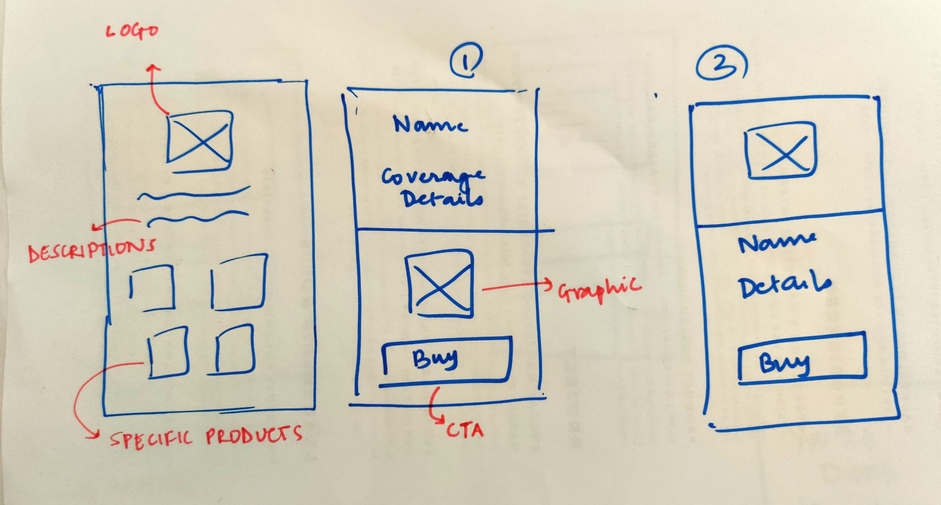
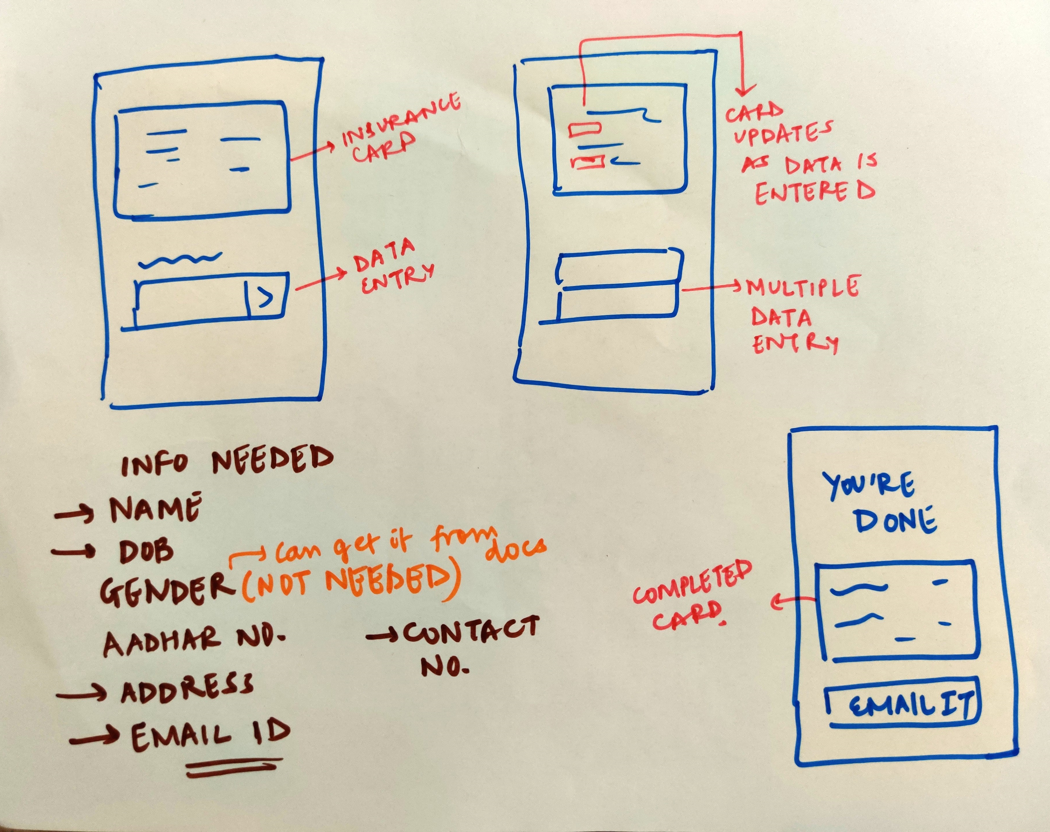
Once I had wireframes that covered all the needs and solved all problems, I went on to create a design language for the interface. The main thought behind creating a design language was to make the team, including design, development, and product to be more efficient with the designs and heighten the harmony between the teams.
When the flow, wireframes, and design language was set, I started with the interface design process directly. The pattern that I followed was to design the most important pages first. I jumped from low fidelity to interface design directly due to time constraints. I scanned the images and used them as an inspiration during the interface design process.
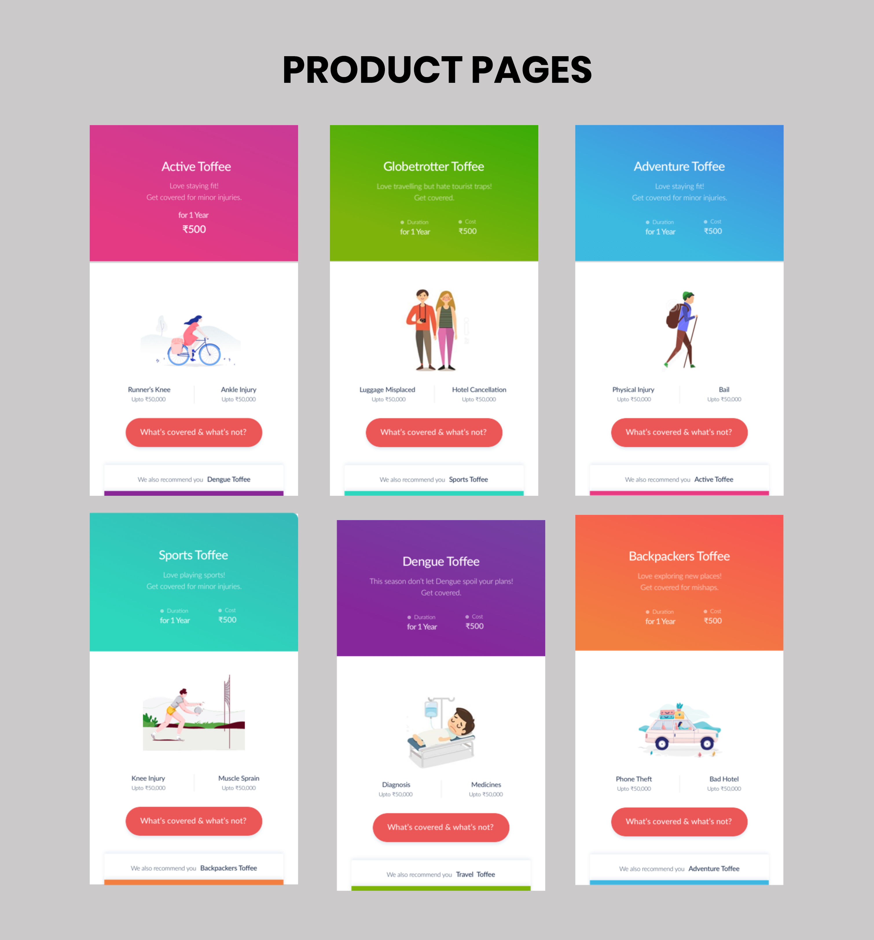
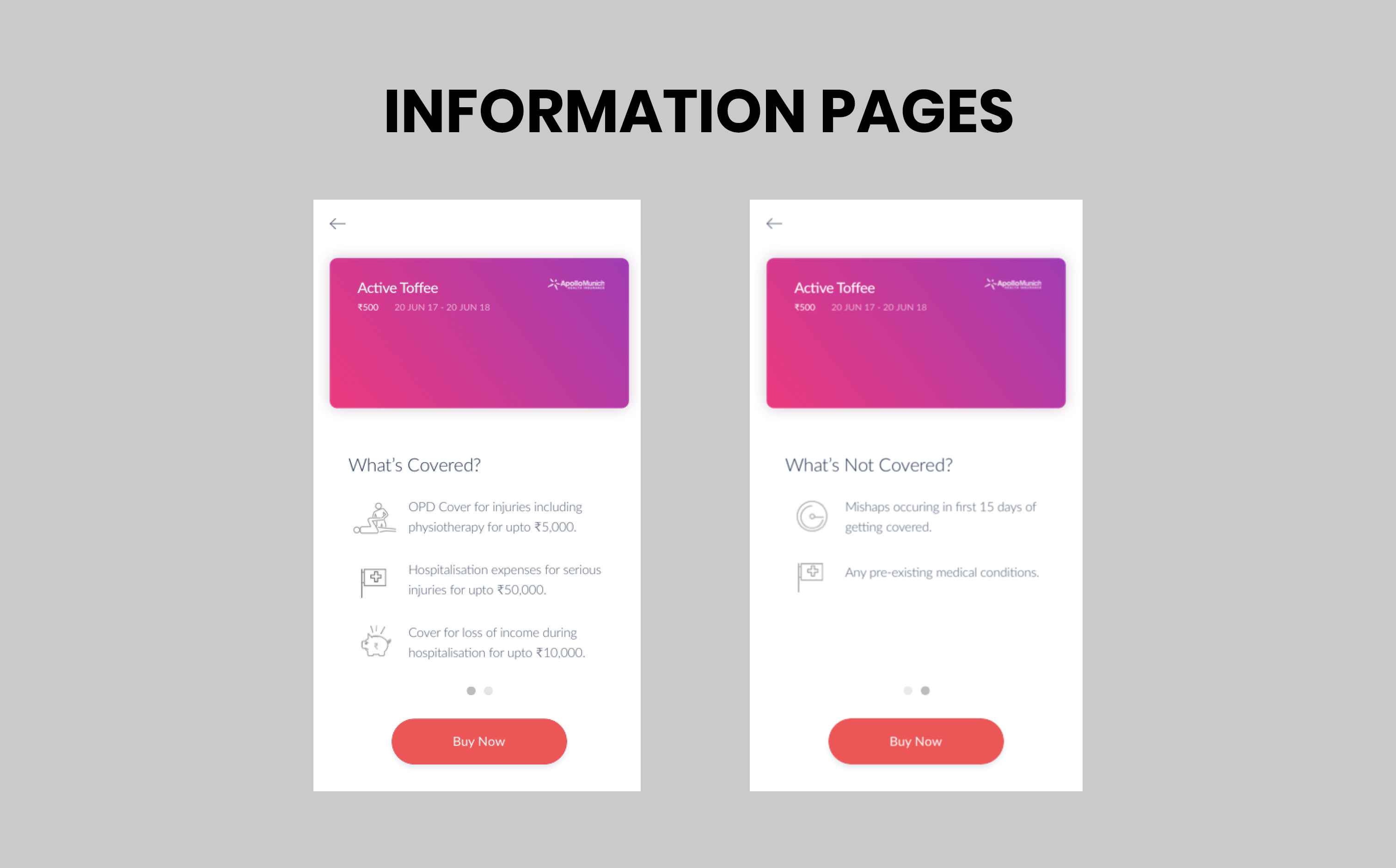
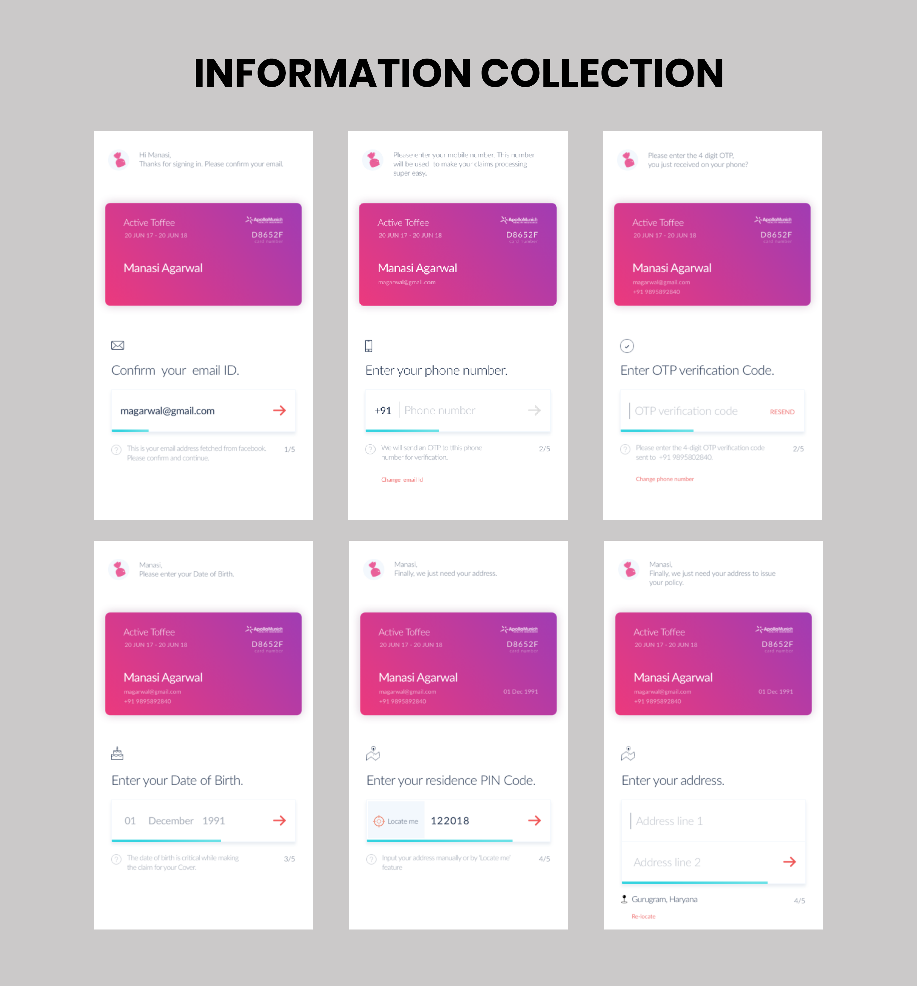

I got an excellent opportunity to learn Principal for Mac white, designing the interactive prototype for the product. The team and I brainstormed on all the possible interaction styles so that the users can interact with the information most efficiently. The most crucial interaction styles were Pagination, horizontal scrolling to see what covered and what's not and, real-time update.
Creating a prototype served two purposes, first, it helped with user testing exercises, and secondly, it served as a deliverable for the investors that helped them make a concrete decision about future steps.

The buying flow involves three main parts.
I was the part of the investment cycle for this product and this prorotype was used for investor pitches. This product received a seed fund round of $100000 and is currently doing really good in the Indian market and it is supported by many of the best venture capitalists in the country.
This internship lasted for 3 months and it helped me learn many valuable sorftware packages and lessons
1.) I got an opportunity to learn sketch, zeplin and principle for mac
2.) I got to be the part of the investment cycle for this product and the product performed really well
3.) I learned how to design a product using Agile Methodologies over the course of multiple sprints.