The aim of this interface to invoke emotions of happiness and excitement hence the use of bright colors and gradients. The elements used to denote a subject are the most basic ones such that there is no difficulty in visualizing the subject names.
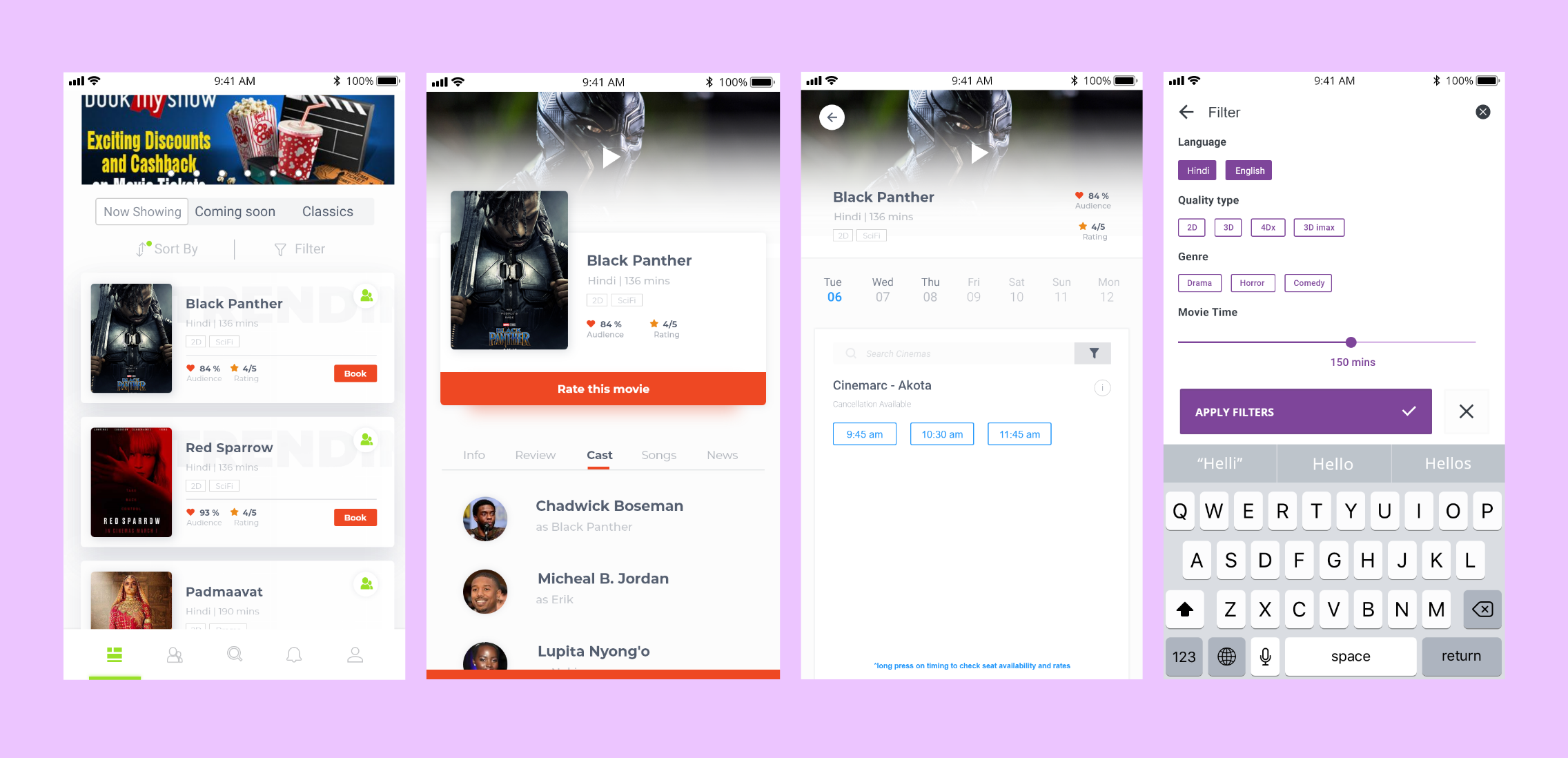
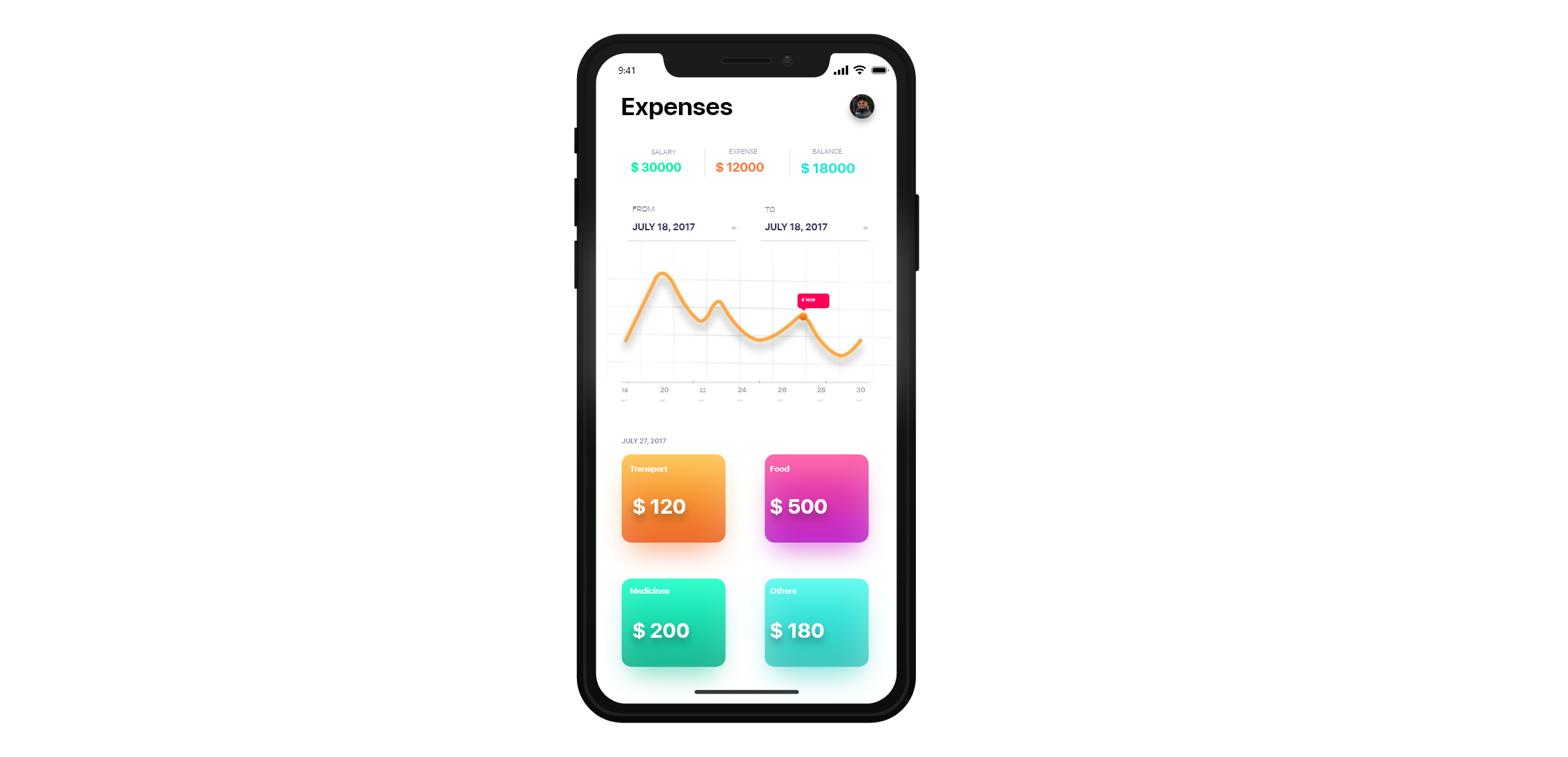
The aim of this design was to present all the information in a clean and clutter-free design which is why white and an accent color (orange) was done. This design choice ensured that the design is clean and the attention is diverted to the important places
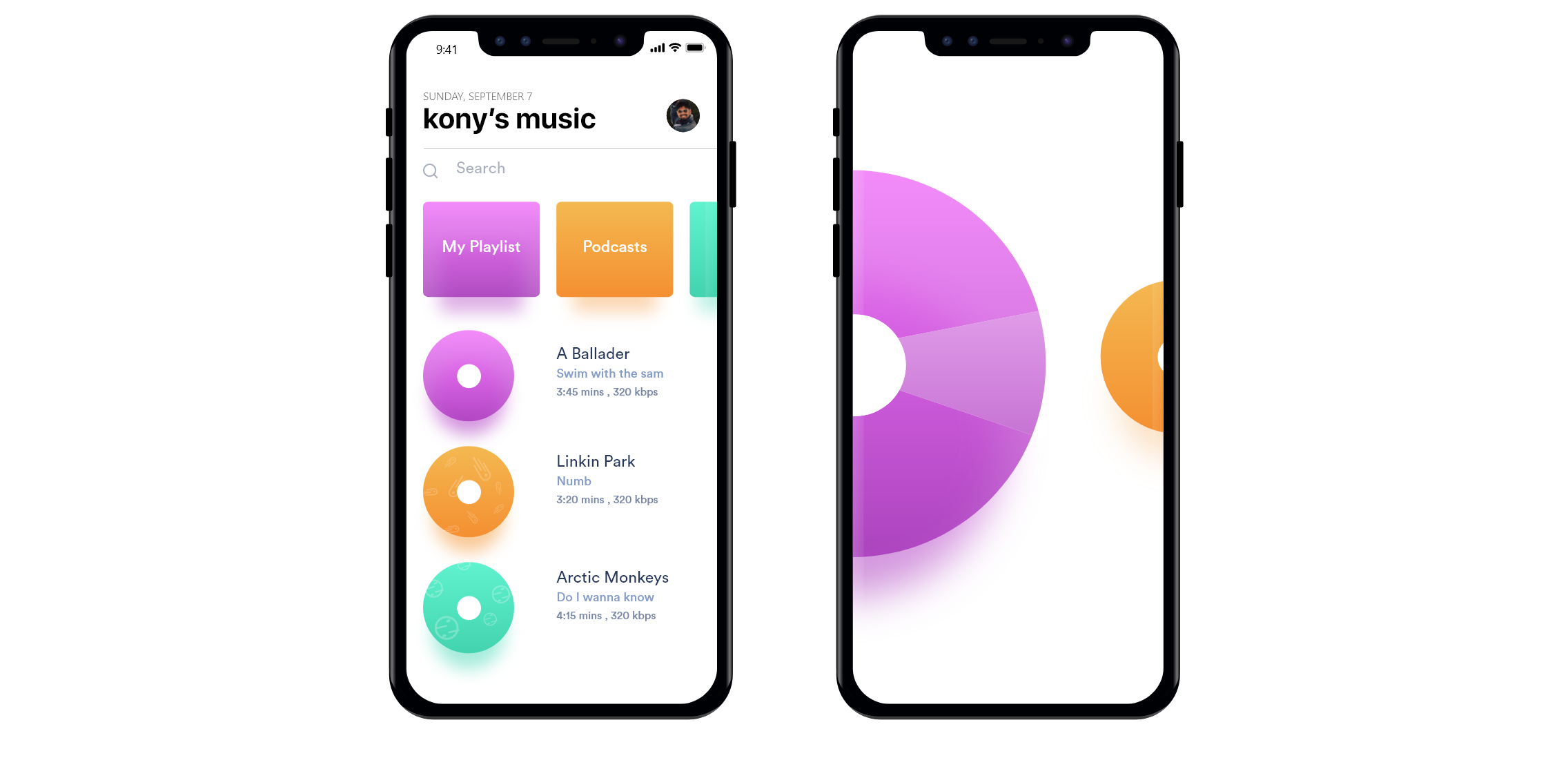
Taking inspiration from a CD player, this design was made to trigger nostalgia. Apart from using gradient and bright color, the designs were made such that the interactions were with the thumb's reach.
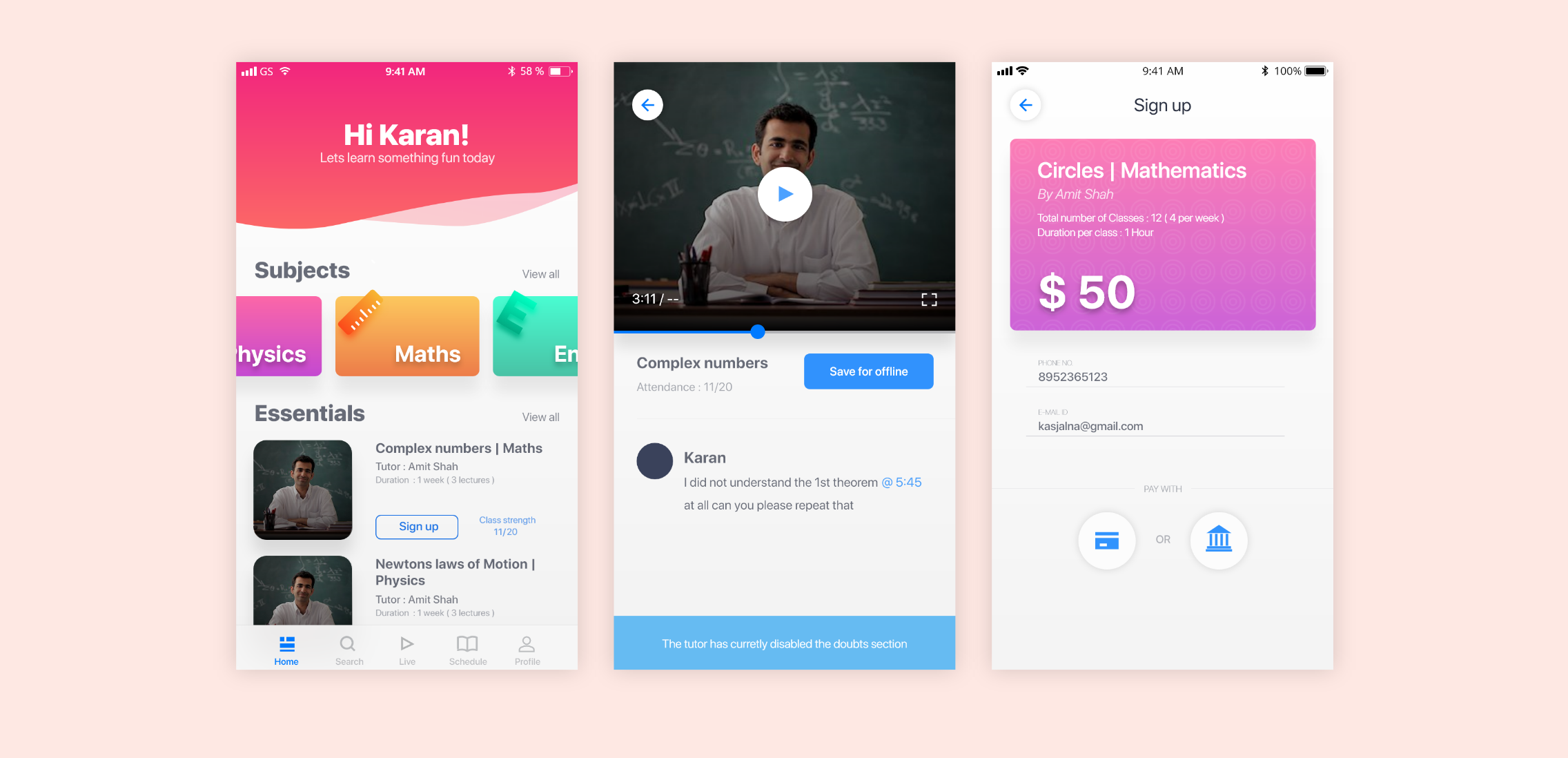
The aim of this design was to use color theory to represent all the information to minimize the confusion.
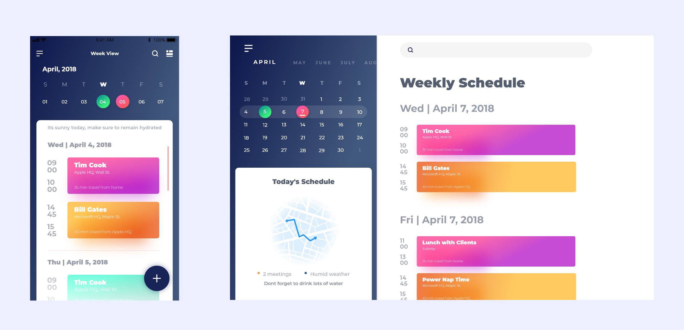
This design aimed to represent cross-platform flexibility for a calendar app. I used a mobile-first approach to design the calendar app and the desktop designs were done using the mobile designs as a reference.
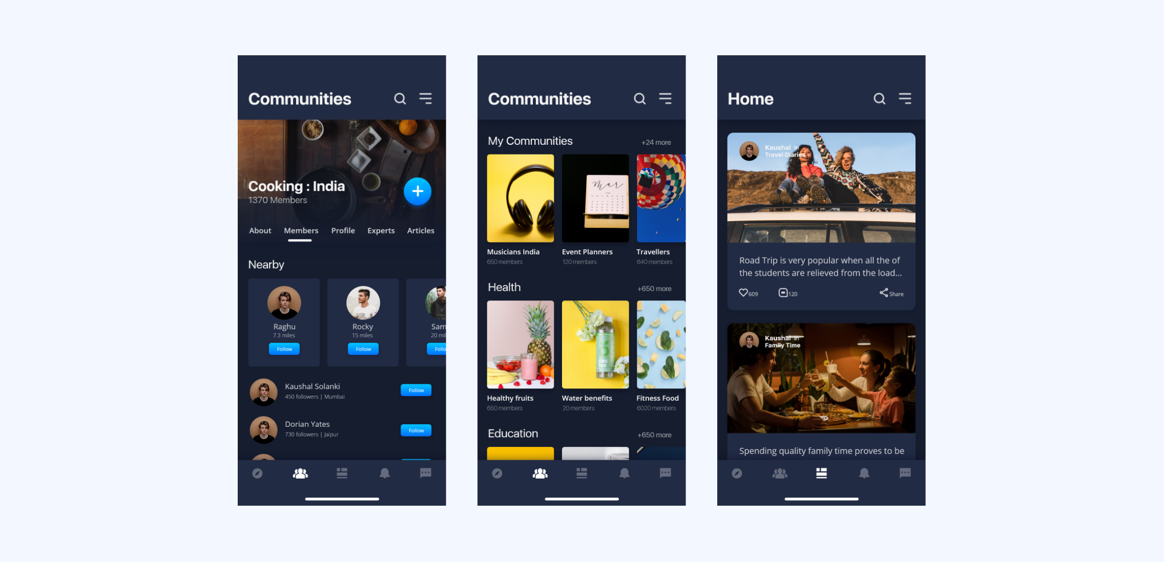
This design was an extension of one of the portfolio project named "COMMUNIFY", I had all the design research guidelines with me, the only thing left was to design an interface that satisfies the guidelines.
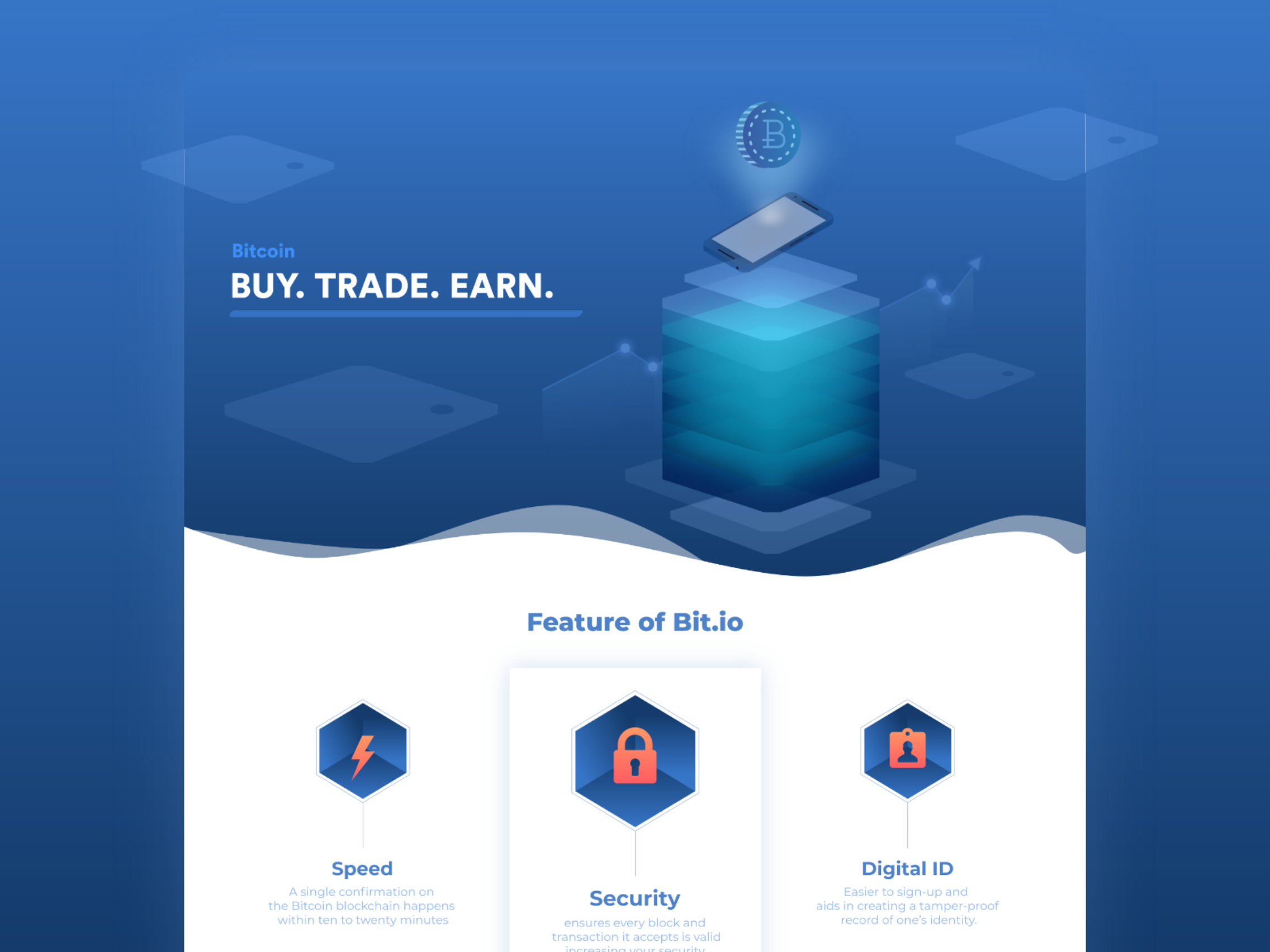
The last day was to design a website homepage using illustrations. Since I was in the process of buying a fraction of bitcoins on that day, I decided to design the landing page for an online Cryptocurrency trading website.